I led the redesign of this product, managed the relationship with our Product Manager, Product Owner, and the development team, and onboarded new designers to the project as needed. I also worked with our design researcher to organize trips to see the redesign in person and for user feedback.
Product design
9 months
Caitlin Roach (Lead)
Missy Yarbrough
Stephanie Ji
Rebecca de Beer
Radius, RapidDeploy’s flagship product, was a platform for Emergency Call Takers to accurately locate callers. It allowed them to track any movement of the caller, communicate via SMS, and gather additional information.
It also let Call Takers see the location of emergencies that came in via methods other than a voice call, like Text to 911, vehicle crash sensors, and panic buttons.
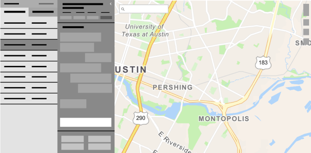
Radius was doing well, as it was meeting a need in the industry that was not already being met by existing products. It provided more accurate locations than the product that were typically used by emergency comms centers. The issues that it faced were mostly focused around the usage of space on the screen. Our challenge was to reduce wasted space, and provide quick access to future features, such as Text to 911.

This redesign was happening in parallel to the beginning stages of our design system (see more about that project here), so it became a testing ground for the components and look and feel that we would be using in that system. We were given a lot of space to rework the product, and, in addition to fixing the UX and space issues, we were able to modernize the look and feel and prep the product for future features that we knew were on the horizon.
The first and main problem that we would tackle was how to rework the way information was laid out and how the space was utilized. We wanted to move the “All orders” table to a location where it would not take over the map space, as the mapping was the main feature that was used in the product. We began by roughing out wireframes to determine how we might arrange the elements.

From these wireframes, we moved to slightly higher fidelity mockups that we could show to our product manager and the development team to get their feedback and any concerns. As we worked through these mockups, we started to refine the use of space and how we felt users could be access the information that they needed at any time.

At this point, we started putting these ideas in front of users for feedback. Feedback was generally positive, with the caveat that it was a new layout that they would have to learn, which, in the industry, means extensive training that needed to be done. This round of feedback was focused on ensuring that they would be able to find the various sections of the interface, and that they would be able to do so quickly, so that we knew it could be done in an emergent situation.
One of the most controversial parts of this project was the map pins. The existing pins had numbering that confused about 50% of users, and the colors being used to differentiate types of pins did not meet accessibility requirements for color contrast.


Our goals in the redesign of the pins was to reduce the use of color in order to reserve specific colors for uses with more defined meaning. We also made a change to the shape of the pin, as the pointed pin tended to mislead users to believing that that point was the most likely spot within the overall radius of where that pin could be. This was not the case, as the "uncertainty radius", which is shown in a larger circle around the pin, represents the area within which the caller could be, with equal probability of them being anywhere within that radius. We also removed the numbering system, instead adding a location timeline to the Radius UI on detail panel for individual calls.

This was our first iteration of map pins, with the new shape, limited color, and tags replacing the numbering system.
These pins, while generally well received in and after testing, met some speed bumps. Depending on the map that customers used, these would occasionally be difficult to see. We intended to solve that problem by creating pin sets and adding animation when pins would drop on the map. We created a concept of the animation, although it was not implemented due to concerns about performance and loading issues.

There were also issues with implementing our initial pin design. The time tags, meant to replace the numbering system, was not able to be implemented in the first release of this redesign, and was regularly deprioritized due to the bandwidth of the development team and weighing it's priority compared to other updates. Users began to complain that they could not tell the order in which the pins dropped, even with a timeline addition. For the time being, we enhanced the location timeline, which I will show in the next section, and revisited the pins as a future project.
Our redesigned interface consisted of two panels, one of which collapsed when not in use, and map controls the interacted only with what the map looked like.
One panel was used to house the calls that a user was currently working on, the queue of incoming calls, and, behind a tab, all of the calls that were being worked on in the center.


Our second panel was used as a place for all details related to a selected call to live. This included information such as the address, phone number, and caller name that were previously only accessed through a map pin tooltip, as well as additional features such as the location timeline, SMS chat with the caller, and additional emergency information that can be retrieved from iPhones and other devices.


This is where calls that the user is actively assigned to and working on live. These can be voice calls, Text-to-911 calls, and signals, which included sources like panic button, crash sensors, etc. Each entry of the list contained information to alert the call-taker to updates, and help them find the right call to return to if needed.

While in most centers, the incoming voice calls are not able to be shown, any ECC that accepts Text to 911 and signals, could view incoming calls of those types in the calls queue. Because these calls are not ones that get routed and answered in the same manner as voice calls, users are able to Accept or Answer the call of their choice, or the type that aligns with their training or role. These calls are sorted into Text to 911, which are given priority due to another person being on the "line", and Signals. They are then ordered with the longest waiting call at the top.

The call details panel was the home base for any and all information about a specific call. This panel could be accessed via the list item in My Calls or All Calls.
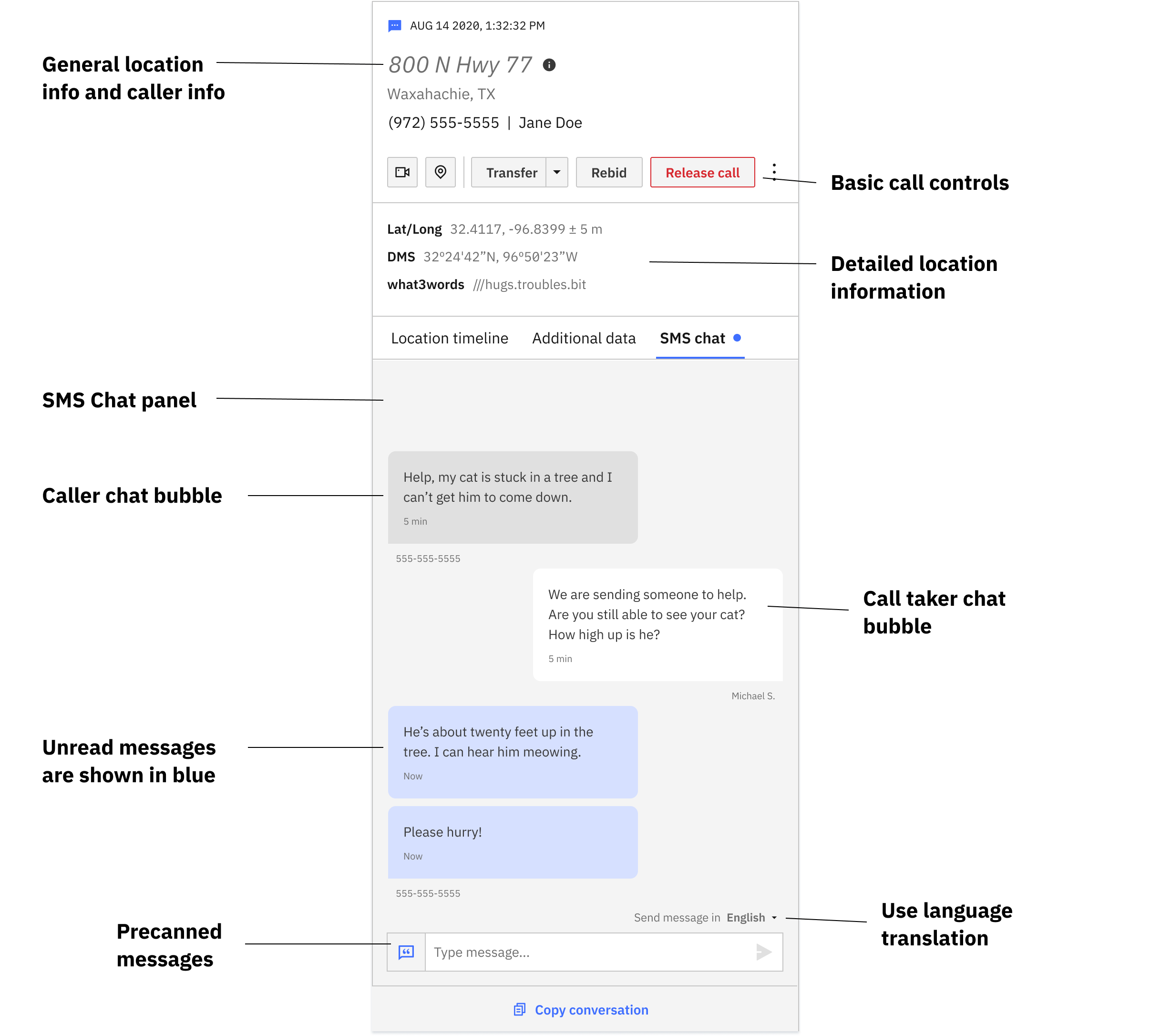


The call details panel was the home base for any and all information about a specific call. This panel could be accessed via the list item in My Calls or All Calls.


If the system failed to find a location, call takers could use the search feature to manually add a location to a call.

If a user clicks on a map pin, they see a map pop up. This provides any details associated to that pin. They can also click "Focus" to center the map on that pin.
The initial redesign of Radius was very well received by both users and the executive team. By the time I left the company, it was in use in over 100 ECCs across the United States in California, Kansas, Florida, and various other states.
We continued to support the development team by answering questions, making small updates, and assisting with QA of the final product to ensure it matched as closely to the design as possible. After this redesign, we continued to design improvements to Radius in response to user feedback and business direction.